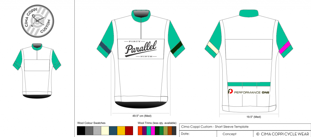
I don't think you need to worry about the 49th logo being TOO big. It is just a mock up and IRL, I think it's big too. It will be downsized but still legible. I ain't no graphic artist, yo.
Here's a mock up with the logos reverse and Performance One logo a bit bigger (for fairness). I also took in Steve's idea about the contrast arm band. I think white would be the most fitting but I have sampled blue, dark green, white, and pink (for you homos

).
Always up for new ideas.
And I figured out how to make the image bigger, my compression level was OVER 9000.
Also something like this:
1.
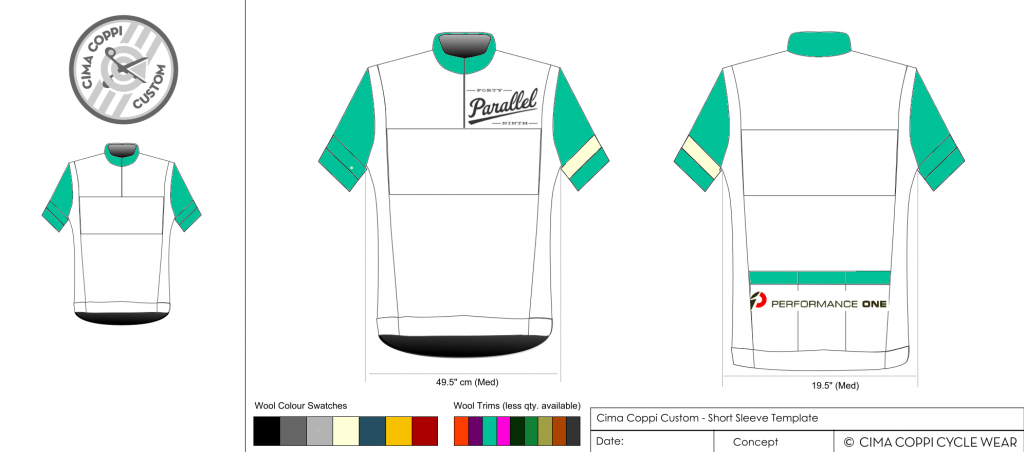
Or this
2.
