This is an interesting chart I hadn't seen before
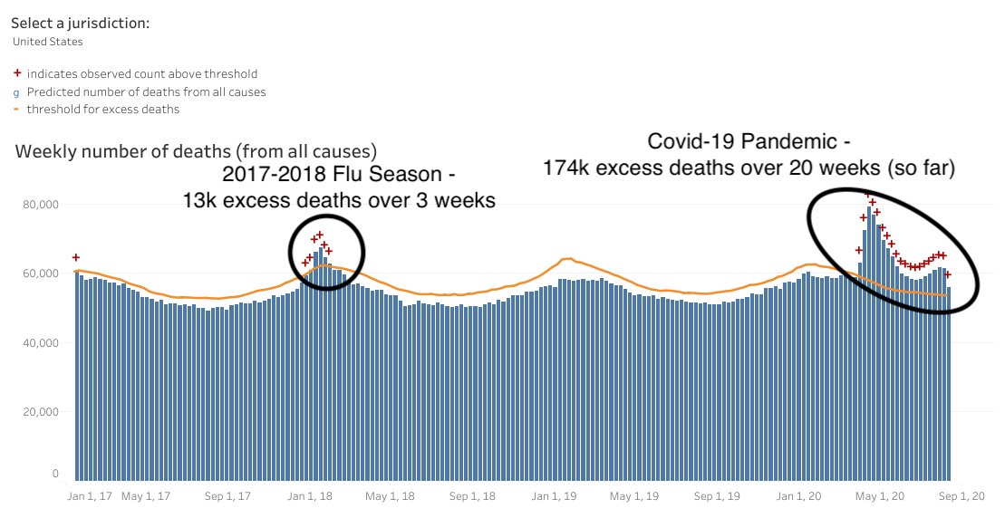
It shows total deaths in US by all causes, and as you can see deaths rise with every flu season. The 17/18 flu season was especially bad, killing 13K more people than usual, over a period of 3 weeks.
Corona though

I know there only people dumb enough to still be comparing this to the flu are gone or banned, but it's still an interesting stat to look at as more data is collected.